Beginner's Guide to Layering Textures in a Neutral Bedroom
A neutral bedroom can look calm or curiously flat, and the difference is rarely the colour. It is texture. When everything in a room sits within a narrow band of chalk, oatmeal, stone and warm grey, the eye has little to grip except surface: the roughness of jute underfoot, the slubs in a linen duvet cover, the soft halo of a wool throw. Get the mix right and a quiet palette feels expensive. Get it wrong and you have a showroom. Here is how to build that depth from the bed outwards, using four dependable fabrics.
Why texture does the work colour usually does
Colour creates contrast through hue. Texture creates it through light. A chunky bouclé cushion beside a smooth cotton pillowcase throws small shadows, and those shadows read as depth even when both items are the same shade of cream. This matters more in Britain than in sunnier places, where strong light does some of the work for you. Our grey winters and low afternoon sun flatter raking light across a weave.
The single most useful rule is this: contrast your weave scale, not your colour. Keep tones within two or three steps of each other, then pair something fine with something chunky, something smooth with something nubbly. Two creams that differ in texture will look more considered than a cream and a biscuit that differ only in shade.
Start with the bed: linen as your base
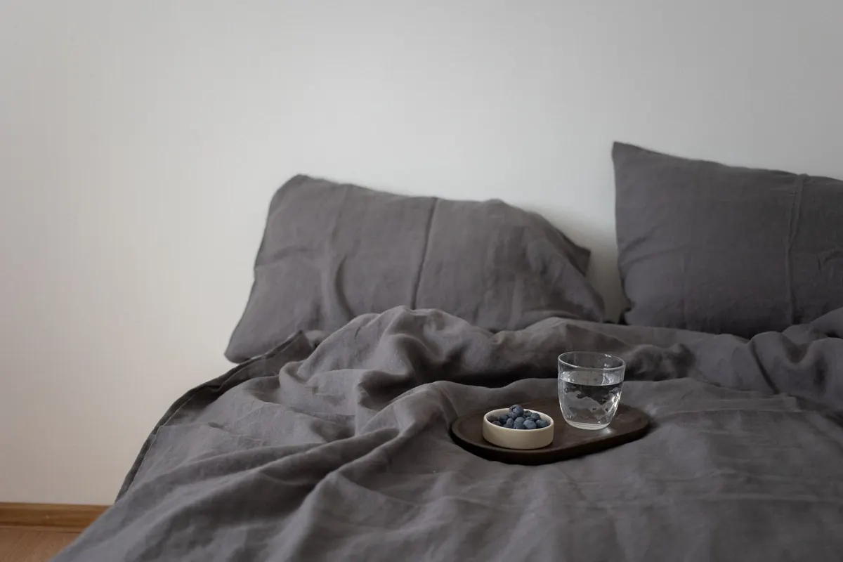
Linen is the natural foundation for a neutral bedroom because it has texture built in without any pattern. Its irregular yarn gives a slightly rustic surface, and it creases in a way that looks relaxed rather than untidy, provided you accept the creases instead of fighting them.
Choose a washed or stonewashed linen duvet cover in oatmeal, pale sand or off-white, with matching pillowcases. That single purchase sets the tone for everything above and below it. If pure linen feels too crumpled for your taste, a cotton-linen blend keeps most of the texture with a crisper finish.
Linen also works beautifully at the window. Unlined linen curtains in the same neutral family filter daylight into something softer, and they add a vertical texture that stops the room feeling bottom-heavy.
Add weight with wool
Where linen is airy, wool is grounding. It absorbs light rather than reflecting it, which makes it the perfect counterpoint to pale walls. A lambswool or merino throw in ecru, pale grey or undyed cream, draped over the foot of the bed, will do more for the room than any extra cushion.
Fold it in thirds lengthways rather than spreading it flat across the whole bed. A folded throw looks deliberate; a spread one looks as though you ran out of duvet. If you want wool nearer the pillows, look for a felted or bouclé cushion cover — the texture is bolder and the itch factor is nil.
Because wool is warm, it earns its place from October to March. Swap it for a lighter layer in summer rather than leaving it out year-round.
Bring in cotton for crispness
Cotton is the straight man of the group, and that is a compliment. It holds a fold, it is easy to wash, and it makes linen look softer simply by sitting next to it. Percale sheets give a cool, dry finish against the skin; a waffle-weave cotton blanket gives shadow and bite.
A white or chalk waffle blanket folded across the lower half of an oatmeal bed is one of the simplest ways to add a third texture without adding a colour. Waffle is particularly good in a neutral room because the grid structure creates its own pattern of light and shade. Cushion covers in cotton canvas or cotton velvet, in the same three tones, bring the texture up to eye level.
Ground the room with jute and other plant fibres
Floors are where neutral bedrooms usually fall down. A pale carpet plus pale bedding plus pale walls leaves nothing to anchor the scheme, and the whole room floats. Jute solves this immediately. It is coarse, matte and slightly darker than most neutral textiles, which makes it read as a base rather than a background.
For a double or king bed, a jute rug that extends roughly half a metre beyond each side gives you somewhere warm to put your feet. Lay a smaller wool or cotton runner on top beside the bed for contrast underfoot. Seagrass and sisal are close alternatives with a finer, more uniform weave.
Two practical notes. Jute sheds a little at first, so give it a thorough vacuum on a low setting. It also dislikes damp, so it is better suited to a dry bedroom than a bathroom-adjacent one.
A layering order that works
- Fix your palette first. Choose three tones maximum — for example chalk white, oatmeal and warm grey — and promise yourself you will not add a fourth.
- Start with the largest surface. Duvet cover and sheets go on first, in the finest weave you own.
- Add one chunky layer. A wool throw folded at the foot of the bed.
- Add a mid-weight layer. A waffle cotton blanket, a quilted bedspread or a cotton throw folded in half.
- Layer the cushions. Three or five, mixing one smooth cover, one nubbly and one woven.
- Ground the floor. Jute underneath, then a smaller wool or cotton rug on top beside the bed.
- Repeat one texture higher up. Linen curtains, a linen-covered headboard or a woven pendant shade so the layering does not stop at mattress height.
Common mistakes, and the quick fix
- Everything at the same weave scale. Swap one item for something noticeably chunkier: a bouclé cushion, a waffle blanket, a chunky knit.
- Too many sheens. Satin, sateen and glossy velvet compete badly. Keep shine to one item, usually a single cushion.
- Too many tones. If the room looks muddled rather than calm, count your neutrals and cut back to three.
- Texture only on the bed. Add a jute rug, a wool stool cover, a linen lampshade. Texture at three heights reads as a scheme.
- Over-filling the bed. Two or three cushions and one throw usually look better than a stack you have to move every night.
Start with one layer this weekend
You do not need to replace everything. Buy a single wool throw or a jute rug, live with it for a week, and see how the room changes. Then check your lighting: texture only becomes visible in raking light, so a warm bedside lamp at low level will show off a weave far better than a bright ceiling fitting. If you want to test this for nothing, drag a lamp across the floor and watch the surface of your bedding change as the light moves.
Once you have your four fabrics working together, season them. Wool from autumn, cotton and linen through spring and summer, jute all year. Wash linen cool and shake it out rather than ironing; the creases are part of the point.
Photo: KATRIN BOLOVTSOVA / Pexels