Explainer: What Is Colour Drenching and How to Use It in a Hallway
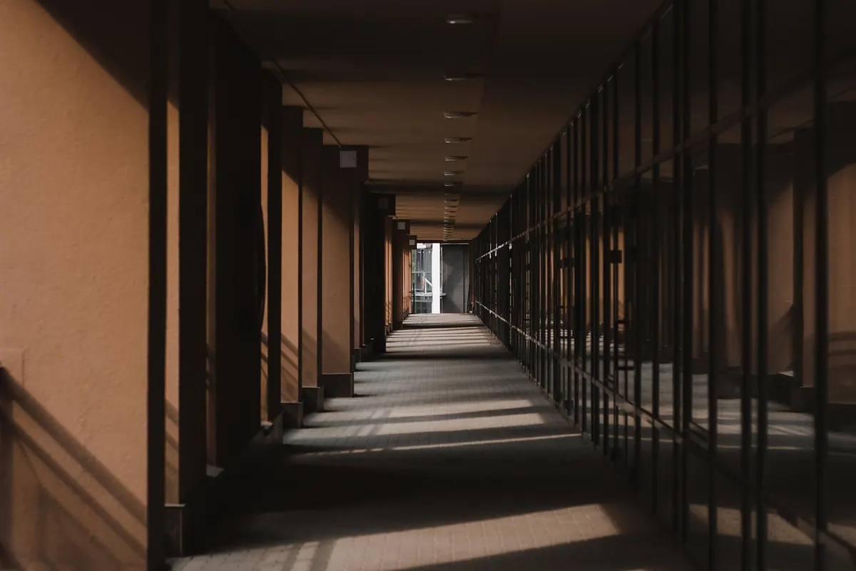
A hallway asks a lot of a colour. It has to flatter you at half past seven in the morning, shrug off bike scuffs and school bags, and make a space barely a metre wide feel deliberate rather than like the job you keep meaning to get round to. Colour drenching settles all of that with one decision — which is why it turns up again and again in hallways that look calm, generous and twice their actual size.
What colour drenching actually means
Colour drenching is painting every surface in a room — walls, ceiling, woodwork, and usually the door and its frame — within the same colour family, instead of the more familiar arrangement of coloured walls, a bright white ceiling and brilliant white trim.
Two things make it work. The first is the removal of horizontal breaks. In a standard scheme your eye stops four or five times on the way up a wall: at the skirting, at the dado or picture rail, at the cornice, at the ceiling line. Each stop is a small interruption, and in a narrow hallway they add up. Paint everything in one tone and the interruptions go; the space reads as a single volume.
The second is tonal variation. "One colour" rarely means literally one tin everywhere. A typical indigo drench uses a deep indigo on the woodwork, a mid indigo on the walls and a version softened towards grey on the ceiling. The shift is subtle enough that you register it as light rather than as a different colour, but it stops the room becoming a flat box.
Why it suits a hallway so well
Hallways are the most interrupted rooms in the house. Doors, architraves, switches, sockets, a radiator, a cupboard — and often one bulb and no window at all. Against that, white trim above indigo walls can look fussy, throwing every fingerprint into relief.
A drenched hallway is more forgiving. Marks still happen, but they read as texture rather than damage. And because a hallway is a pass-through rather than somewhere you linger, it will carry a depth of colour that would feel heavy in a kitchen or a bedroom. Deep indigo at seven in the morning with the light on is atmospheric; deep indigo in the room you spend every evening in is a much bigger commitment. There is a practical bonus, too — fewer tins, fewer decisions, and less fiddly cutting in between two finishes.
Choosing the right indigo
Indigo sits between blue and violet, so it can lean either way, and the lean changes everything.
- Indigo with a grey base — calm and slightly cloudy. The safest choice for a small, dark hallway, and easy to live with alongside pale wood floors.
- Indigo with a violet base — richer and warmer. Good in north-facing hallways, where cooler blues can turn flat and smoky.
- Indigo close to black — dramatic and enveloping. Beautiful in a wide hallway or stairwell, more demanding in a two-metre corridor unless the lighting is generous.
Test it in your own light
Sample pots, painted on lining paper rather than straight onto the wall, two coats, left to dry. Tape them up and look at three moments: in daylight, at dusk, and with the hall light switched on. Hallway light is peculiar — often artificial and warm — and it will pull an indigo somewhere the paint chart never showed you.
How to paint it, in order
- Decide your tone map first. Write down which colour goes where before you open a tin. Deep on the woodwork, mid on the walls, softened on the ceiling is a reliable starting point.
- Prep properly. Fill and sand dents, and wash the woodwork — hallway trim collects grime that paint will not sit on happily.
- Ceiling first, then walls, then woodwork. Any drips then land on surfaces you have not yet finished.
- Do the woodwork last — skirting, architraves, picture rail, door frames — and use a small brush along the edges. This is where the scheme either looks crisp or looks like a weekend job.
- Finish the door. Painting the hallway side of internal doors and the inside of the front door completes the effect. Keep the street-facing side of the front door as it was.
Finishes, and what to leave alone
Sheen is not colour, but it changes how colour behaves. Hallways take more traffic than almost any room, so walls want a washable finish — a durable matt or low-sheen emulsion — rather than a flat matt that marks if you look at it sharply. Woodwork is best in something harder-wearing such as eggshell or satin, which will also bounce a little more light into a dark corner.
Drenching does not mean everything, though. A few things are worth leaving out, either to add contrast or because painting them is a bad idea.
- Light switches and sockets. You can colour-match them, but brass or black often looks deliberate and is less trouble.
- The floor. Wood, tile or stone gives the eye somewhere to rest.
- Radiators. Painting one in the same colour makes it vanish, which is usually exactly right — just use a paint made for the job.
- Balustrades and handrails. A handrail in bare or oiled timber is warmer than a painted one and will not show wear in the same way.
If you rent, check your agreement before you start. A change this comprehensive usually needs your landlord's permission, and it is far easier to ask first than to explain afterwards.
Making it work day to day
Keep a small labelled pot of each colour for touch-ups. Deep indigos show chips on the woodwork more than white does, and a five-minute repair with the right tin is invisible; the wrong one is not. Add a lamp or two at low level — a wall light, or a small table lamp on a console — so the colour has warm light to sit in after dark, and hang a mirror to bounce what daylight there is back across the walls.
Then leave it alone. That is the point of colour drenching: it needs no gallery wall, no careful arrangement of hooks and baskets to justify the colour. Paint the whole thing indigo, put your keys down, and let the hallway get on with being a hallway.
Photo: TheFelip / Pixabay